|
|
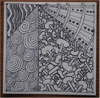
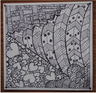
Assignment #1: Zentangle is a project in which you use different shapes and lines in order to create a beautiful piece of art. This project is supposed to be very relaxing and therapeutic and you're not allowed to erase. By doing this activity, I learned that you shouldn't be afraid to do art without an eraser because you can easily turn a mistake into a cool pattern and manipulate it to make it look like it was put there on purpose. The elements of art that are present in these pieces are line, shape, and space. Lines are used through straight lines, curved lines and even zigzag lines. Shapes are used through boxes, circles, and hearts. Space is also used because I made sure to use all of the space possible in order to make the four different sections look full and this was possible by making the different shapes and patterns vary in size. The principles of design that are evident in these pieces are unity (balance) and contrast. I achieved unity in my pieces through repetition of different shapes and patterns and I achieved contrast by varying the sizes of different shapes and patterns.
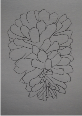
Assignment #4: Modified Contour Drawing of a Pinecone
Assignment #5: Elements of art
Sarah's Vicious Ferret Liked To Scratch Cathy
Shape Value Form Line Texture Space Color
*People in my group: Katie B (she hasn't been here so I'm not sure if she counts), Catherine M*
Sarah's Vicious Ferret Liked To Scratch Cathy
Shape Value Form Line Texture Space Color
*People in my group: Katie B (she hasn't been here so I'm not sure if she counts), Catherine M*
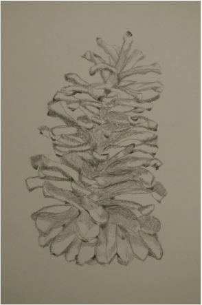
Assignment #7: Pine cone Drawing Exercise
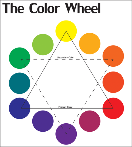
Source: http://imgkid.com/color-wheel-chart-for-kids.shtml
Color Wheel and Color Schemes:
- Primary - red, yellow, blue
- Secondary - orange (yellow+red), violet or purple (red+blue), green (blue+yellow)
- Cool - blue, green, violet or purple
- Warm - red, orange, yellow
- Complimentary - colors directly opposite from each other on the color wheel such as red and green, yellow and violet or purple, blue and orange
- Analogous - colors that are next to each other on the color wheel such as green, blue-green, blue
- Intermediate - these colors are combinations of both primary and secondary colors: red-violet, red-orange, yellow-orange, yellow-green, blue-green, blue-violet
- Triad - uses three colors equally spaced around the color wheel...best represented by an equilateral triangle: primary and secondary colors are two triad color schemes
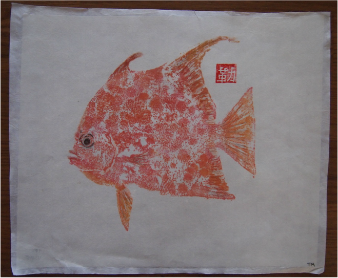
Project #1: Modified Gyotaku Print:
While modifying my print, I used warm colors in order to fill in my fish's fins. These colors included orange, red, yellow, brown, and black. I chose these colors because I painted my fish in red and yellowish orange and I wanted my details to blend in with the rest of the fish. Although, I did use black on the fish's eye because I wanted its eye to stand out and I used some black on my fish's fins in order to really define them. Because I used a warm color scheme, the colors make me feel as if the fish is not the most friendliest fish as it makes him look angry and mad. The colors also make me feel rushed and kind of nervous because they're so bright.
In order to print the fish, I first picked out a rubber fish model that I liked the most and painted my whole fish red and then went back over its fins with yellow. We used watercolor paint in order to paint our fish but you have to be very careful to not get too much water because otherwise your print will not come out correctly. Then, I took rice paper and put the textured side of the rice paper on top of my fish and just gently tapped my fingertips all over my fish until it was completely printed onto my paper. We then let our print dry for 24 hours and then modified it. In order to modify the print, I used Prismacolor pencils to add details onto my fish's fins and to define my fish's eye. Then, it was time for me to wet-mount my work. In order to do this, I took the front of my print and put in face down onto a glass table (or Plexiglas) and used rice paste to paste it onto the table. In order to paste your print, use a soft brush and dip it into the rice paste and start at the center of your print and work your way out as this helps any air bubbles to get out. You continue to work from the center until your print is completely covered and you've gotten as many of the air bubbles out as you can. Then, take some paper towels and wet them with water and clean up all of the excess rice paste that got onto the table until there is none left around your print. If you do not do this, you will get glue on parts of the backing paper where you do not want it. After you have cleaned up, take the backing paper and center the rough side of the paper on top of your print and tapped it down gently. Then, to remove any excess moisture, put a newspaper on top of your print and take a whisk broom and apply a good amount of pressure all over the newspaper while still working from the center out. Then, remove the newspaper and apply a thin line of rice paste along each edge of your backing paper as this is what will be mounted onto the wooden board. Next, pull up your work by just pulling up one corner and use the whisk broom to put behind that corner and just gently remove your work from the table. After it is removed, paste it onto the wooden board and gently sweep across each corner to paste it to the board and then stipple across each edge of your backing paper where you applied glue but make sure you do not paste your print onto the board as this will mess up your picture because it will be glued to the board. Once you've waited 24 hours for your picture to dry, just take an X-ACTO knife and cut out your picture by cutting each side between your thin line of glue and your print.
When I first found out what we were doing, I was super excited because I think relief prints are so cool. I also really liked the project as we were modifying it because we got to add whatever details we wanted and use whatever colors we wanted. Although, when I found out that we were wet-mounting our prints, I was a little nervous because I had never wet-mounted anything before. But, when it was my turn to wet-mount, Katie helped me do everything correctly and I actually really enjoyed it and wasn't nervous anymore as I had cut out a print before. I think that I was very successful with this project as I really like my print and the colors that I used when modifying it. The only mistake that I made was that I hardly had any room for glue on the bottom of my backing paper but I was still able to make it work and it turned out nicely.
Self-Directed Learner:
I believe that a self-directed learner is someone who is always on task and does what they're supposed to do without being told. I also think that a self-directed learner is someone who will take the initiative to do something. I think that I am definitely becoming a self-directed learner because I am always on task and I try to help cleanup as much as I can. I am also a self-directed learner because I have taken the initiative and time to really work on my website and put a lot of effort into it.
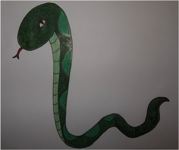
Assignment #8: Preposterous Crosslinks:
Snake & a ruler as a tail (I'm not so sure that you can tell that his tail is a ruler)
Snake & a ruler as a tail (I'm not so sure that you can tell that his tail is a ruler)
Assignment #10: ECU Arts Education Day Field Trip:
On Tuesday, March 3, the National Art Honor Society and the art class traveled to East Carolina University to their Arts Education Day. When we arrived at ECU we were taken to Hendrix Theatre where all of the visiting schools were to be seated. After watching some short videos and presentations about the university, all of the schools were split up into little groups. Each group was taken on a mini tour of ECU's campus and then taken to a dining hall to eat lunch. After lunch, each group was assigned an adult leader and taken to many different art classes. Not only did I get to see what students were doing in their art classes but I even got to try some of their projects out. For example, we visited the textile class and were able to dye a piece of silk using wax resist and I got to learn about many new dying techniques that I had never heard or seen before. Overall, I loved this art trip because not only did I get to see some of the art classes offered at ECU but I even got to learn more about the campus because of the mini tour. I also really enjoyed this trip because I found out that I may want to take a textiles course in college. I never knew how interesting textiles were until we visited the textiles class and saw the many different techniques used in order to get different patterns and textures.
On Tuesday, March 3, the National Art Honor Society and the art class traveled to East Carolina University to their Arts Education Day. When we arrived at ECU we were taken to Hendrix Theatre where all of the visiting schools were to be seated. After watching some short videos and presentations about the university, all of the schools were split up into little groups. Each group was taken on a mini tour of ECU's campus and then taken to a dining hall to eat lunch. After lunch, each group was assigned an adult leader and taken to many different art classes. Not only did I get to see what students were doing in their art classes but I even got to try some of their projects out. For example, we visited the textile class and were able to dye a piece of silk using wax resist and I got to learn about many new dying techniques that I had never heard or seen before. Overall, I loved this art trip because not only did I get to see some of the art classes offered at ECU but I even got to learn more about the campus because of the mini tour. I also really enjoyed this trip because I found out that I may want to take a textiles course in college. I never knew how interesting textiles were until we visited the textiles class and saw the many different techniques used in order to get different patterns and textures.
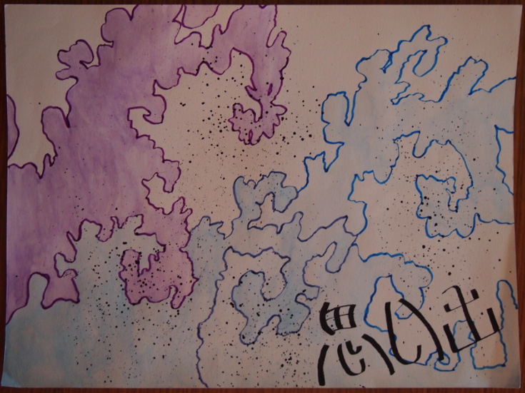
Project #2: Independent Japanese Project:
I was inspired by the print The Great Wave off Kanagawa by the Japanese artist Hokusai. The print contains beautiful waves with very intricate curls. I found the curls fascinating and decided to do a fractal (a never-ending pattern) of the curls in the shape of the original print's waves. I drew the waves with watercolor pencil and decided to go with a cool color scheme since I'm trying to portray water. I then outlined the waves with colored calligraphy ink and pens in order to better define their shapes and color. Because the wave in the middle of my project is a darker blue but there is only one shade of blue calligraphy ink, I mixed the purple and blue ink in order to make a beautiful violet color. Then, because waves spray water when they're crashing, I decided to make splatters using black calligraphy ink and hit two very small paintbrushes together. I then wanted to add the word "memories" in Japanese to my project as I was inspired by the Japanese poem Kasa No Iratsume. This poem talked about waves crashing and their resemblance to memories.
I was inspired by the print The Great Wave off Kanagawa by the Japanese artist Hokusai. The print contains beautiful waves with very intricate curls. I found the curls fascinating and decided to do a fractal (a never-ending pattern) of the curls in the shape of the original print's waves. I drew the waves with watercolor pencil and decided to go with a cool color scheme since I'm trying to portray water. I then outlined the waves with colored calligraphy ink and pens in order to better define their shapes and color. Because the wave in the middle of my project is a darker blue but there is only one shade of blue calligraphy ink, I mixed the purple and blue ink in order to make a beautiful violet color. Then, because waves spray water when they're crashing, I decided to make splatters using black calligraphy ink and hit two very small paintbrushes together. I then wanted to add the word "memories" in Japanese to my project as I was inspired by the Japanese poem Kasa No Iratsume. This poem talked about waves crashing and their resemblance to memories.
|
|
|
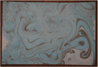
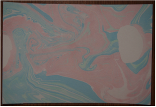
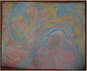
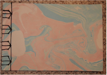
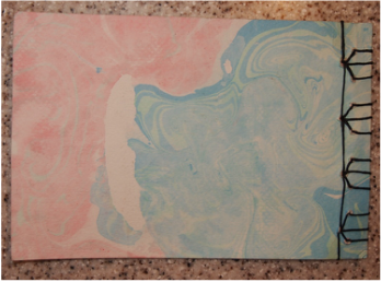
Assignment #11: Marbling-Suminagashi:
I learned two different methods on how to marble paper. The first method I learned included the dots that came with the marbling kit. With this method, you punch out as many dots as you want to use from the sheet and you get them completely wet inside of your tub of water. These dots can be placed anywhere in the water as they will eventually move as the marbling ink is added. Next, you take any colors that you want and drop one drop onto the dots that you placed in the water directly from the marbling ink's tube. You can use as many colors as you want on each dot as you just drop each color onto the dot and this causes the dots to move and for your ink to spread out. When you've added as much ink as you want, you can either use your finger, the end of your paintbrush, or you can blow on the water to create currents which create really pretty patterns with the water in your tub. Next, you use watercolor paper and put the rough side face down into the water and then lift it up and set it on some newspaper. Then, you take a paper towel and dab all of the water off of your paper and place it onto the dry rack.
The other method that I learned is actually very similar to a technique used to create a pattern on your nails. First, you take all of the colors that you want to use and drop some of each color into a palette. Then, you take some small paintbrushes and get a color onto your brush and then lightly touch the water as it will spread out and create a circle. Then, you take another paintbrush and get a different color onto your brush and lightly touch the water inside of your previous circle. You then continue this pattern until you're satisfied and then use your finger, the end of your paintbrush, or you can blow on the water to create currents. Then you take a piece of watercolor paper and put the rough side face down into the water and then lift it up and set it on some newspaper. Then, you take a paper towel and dab all of the water off of your paper and place it onto the dry rack as well.
Front
|
Back
|
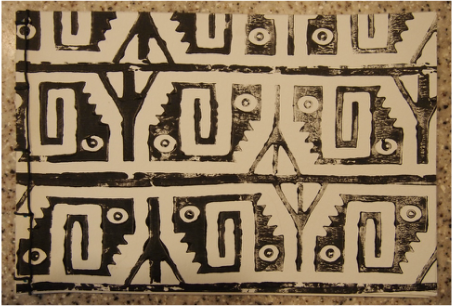
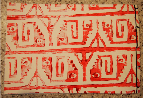
Assignment #13: Japanese Slab Binding Bookmaking Project (PROJECT #3)
Front
|
Back
|
Assignment #14: Tortoise Stitch Binding Bookmaking Project (PROJECT #4)
Assignment #13 & #14: Bookmaking Projects (PROJECTS #3 & #4)
Both of the Bookmaking Projects were a lot of fun, but they were also a lot of work. I really enjoyed making the book covers for my Japanese Slab Binding because I got to use a patterned roller. The binding for our first project was fairly easy, but it still took me a little while to become a master. For the Tortoise Stitch Binding, I already had some marbled paper in my box, but I was terrified to try this stitch. The instructions that we were trying to follow were extremely confusing and not very helpful so I ended up just playing around and eventually figuring out the stitch. Because I was the first one to figure out how to successfully do the Tortoise Stitch, I was able to help the rest of the class make their books. I personally really enjoyed helping the rest of the class because I love helping others and it gave me a great experience as being a leader to my peers. These books were a lot of fun and the most complicated process of the bookmaking (the binding) was totally worth the work because of the beautiful books that they created.
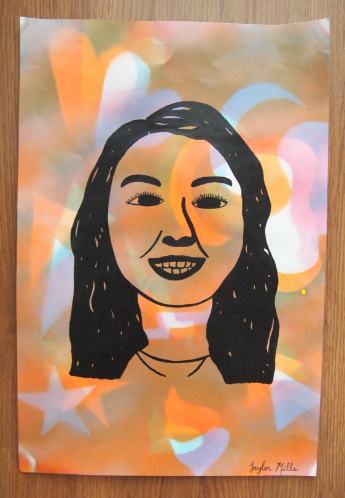
Project #5: High Contrast
Project #6: High Contrast on Yearbook Page
